Intention
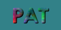
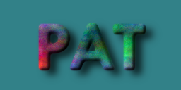
This tutorial is intended to introduce you to a few simple commands, and some concepts in order to create a logo that appears to be floating above a background, like this:
The concepts are ones that you’ll likely come across multiple times while working in graphics processing. Layer masks are used to isolate
a part of an image, thus allowing it to be placed over a random
background for instance. The addition of a drop-shadow effect to make an
object appear to be floating over the background is another example.
Getting Started
Create a new image of appropriate size for your logo:
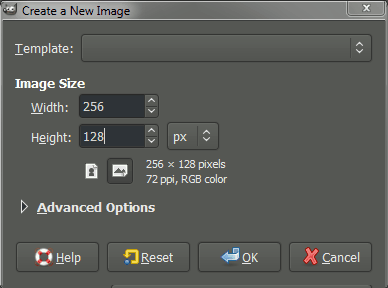
This will open the “Create a New Image” dialog, with options for you to specify:
You can make this new image any dimensions you want, but for this tutorial I am going to specify a Width of 256 px, and a Height of 128 px. I haven’t specified any other options. When you’re ready, hit “OK” to create the new image.
You’ll be presented with the new image on your canvas. Chances are it will be a pure white image at this point (it may be a different color depending on how your GIMP is setup to handle new images - if it is, don’t worry).
Fill the New Image with Black
The first thing we are going to do is fill our new image with black. The first step to doing so is to make sure that the Foreground Color is appropriately set. Click on the foreground color in the Color area to bring up the “Change
Foreground Color” dialog (if your foreground color is already black you
don’t have to do this step, but it can’t hurt to learn):
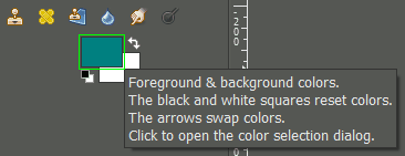 Click the foreground color to change.
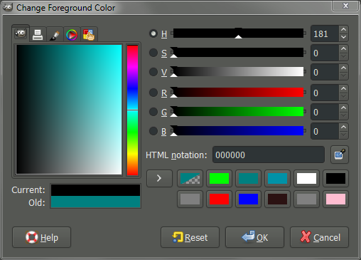
The “Change Foreground Color” dialog allows you to now set the
foreground color. We want to set the color to black RGB(0, 0, 0):
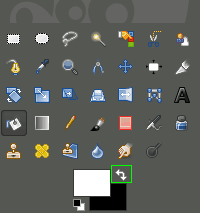
With the foreground color set, we can now use the Bucket Fill Tool to fill in our image:
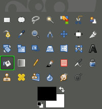 Activating the Bucket Fill tool.

Once the tool is
activated,
your cursor should appear as to the left. To fill the layer you need
only click on the image area at this point. Your image should now fill
with black.
Adding Some Text
Now we want to add text to our image to create our logo with. To see
what we’re doing, though, will require us to change the foreground color
to something other than black (black text on black background doesn’t show up so well).
Now, you can follow the above procedures again to set the foreground color. If your background color is already white, though, you can quickly swap foreground/background colors using the arrows:
 Swap Foreground/Background quickly.
You can also use they keyboard shortcut “X” to swap the colors.
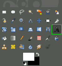
With the foreground color set to white, we can now use the Text Tool to add some text to our image:
 Activating the Text Tool.
We can now draw a box on our canvas (image) to hold the text. You can
click on the canvas where you’d like the top-left corner of your box to
be, and drag the mouse
down to the bottom right corner. You don’t have to worry about being
exact at this point, because you can adjust the boundaries of the box
after the fact.
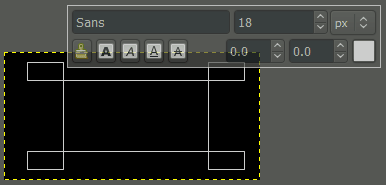
This is what you should see on your canvas after clicking and dragging
from the top-left to the bottom-right to define your text box:
 Defining the text box boundaries.
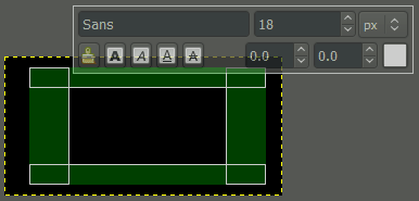
If you’d like to re-size the box for some reason, you can now click and drag in any of the green areas shown below:
 Resize handles to modify text box boundary.
Your text will go into the black box inside the green areas shown above.
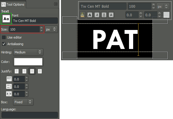
Once the text boundary box is sized appropriately, we can just type some text. In my case, I’ll use my name:
 Text Tool Options (left), canvas view (right).
Chances are when you first start entering text, it will be very small on
your canvas. So let’s have a look at some options on the Text Tool Options palette (left, above).
If you want to make your text appear bigger, you can change the Size in the field shown.
For instance, here I’ve chosen to set my Size to 100px.
You may also not like the font that is chosen by default. In that case, we can change the Font
to something better by clicking the icon. This will open a drop-down
to scroll through all the fonts that GIMP knows about on your system.
You can see in my example that I’ve changed the font to “Tw Cen MT
Bold”.
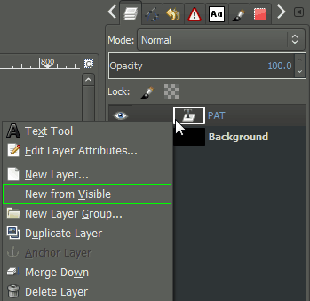
 Creating a new layer from all visible layers.
Once we’ve gotten the text how we want it, we can now create a new layer
from all the visible layers so far (the text layer, and the black
background layer). On your Layers tab, right click on the text layer we just made, and choose “New from Visible”.
Alternatively, you can also create a new layer from visible using the menu:
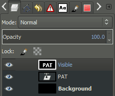
At this point, our layer palette will have three layers on it, the background, the text (“PAT”), and our new layer “Visible”:
Notice that there is a white border around the “Visible” layer. This
indicates that this layer is currently active, so that any operations we
perform will apply to this layer.
Which is good, because we are about to blur this new layer a bit!
To apply a slight Gaussian blur to this layer, we simply invoke the command through the menu:
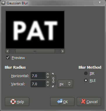
This will invoke the Gaussian Blur dialog, where we can specify how much blur we want to apply:
The defaults were pretty good, but I wanted just a tad more blur, so I increased the Blur Radius to 7. When you’re done, just hit “OK”.
Adding Some Color
Now that we have our text done, it’s time to add a splash of color!
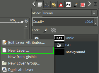
We are going to add a new layer to our image first:
Or by Right-Clicking on the “Visible” layer in the layer palette, and choosing “New Layer…” from the context menu:
 New Layer using the Right-Click context menu.
The “Create a New Layer” dialog will appear - it doesn’t matter what it gets filled with, so you can leave it at whatever Layer Fill Type it’s set at (White by default I believe). Hit OK to create the new layer.
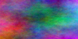
We are now going to fill this new layer with some color to add some interest. To do this we will use the Plasma plugin:
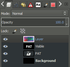
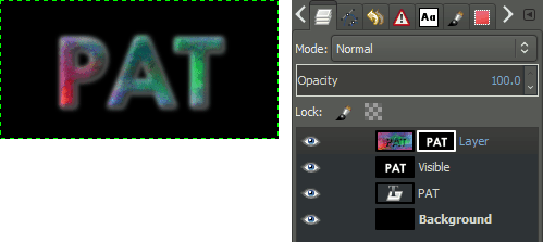
I just left the default values and hit OK, but feel free to fiddle with the values. Our layers now look like this:
Here is what my canvas looks like right now (with the plasma layer on top and visible):
Bump Mapping
Now we’re going to use the text we created earlier to generate a fake 3D
shape on this plasma layer. The process is known as “bump mapping”. I
won’t get into the technical details of how this works, as it is best
seen rather than explained. Open the Bump Map dialog through the menu:
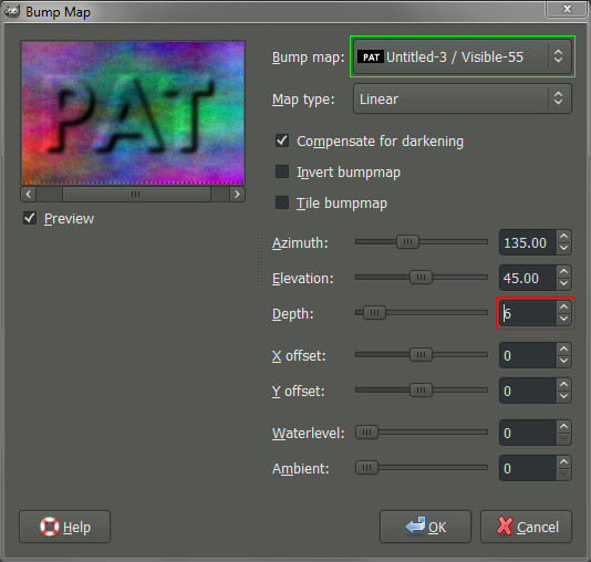
The Bump Map dialog gives a good preview of what the plugin does:
To get it working correctly, this plugin requires that you properly point to the source for the bump mapping.
In our case the source is the text layer we created earlier (the layer was named “Visible”).
So we’ll click on the spinner for the Bump map, and choose our “Visible” layer from the list.
As before, feel free to play with the options.
The only one that I changed was the Depth to increase the illustion of depth (I finally set the value to 6 in my example).
Once it looks good, we’ll hit the OK button to apply it to the layer.
Apply a Layer Mask
Now we are going to use a Layer Mask to isolate our bump mapped text. First we need to add a Layer Mask to the plasma layer:
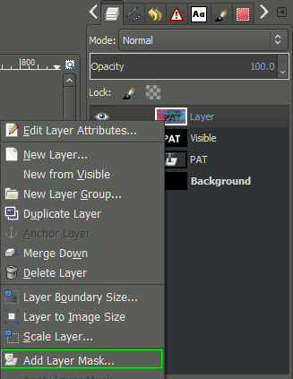
Or Right-Click on the plasma layer and choose “Add Layer Mask…” from the context menu:
When the “Add a Mask to the Layer” dialog comes up, set the Initialize Layer Mask to: White (full opacity).
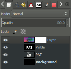
Once you’ve added a mask to the plasma layer, your layers should now look like this:
Remember, you can tell which layer (or mask) is active by noticing which
one has the white border around it. The layers above show that the
plasma layers mask is active (there is a white border around the white
mask, so it’s hard to notice, but no other layer/mask has a white border.
We are going to copy the “Visible” layer, and paste it into the layer
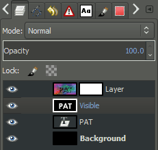
mask for the plasma layer. So first, Left-Click on the “Visible” layer
in the layers palette to activate it:
 Remember, the white border will indicate the layer is active.
With the layer active, we want to now copy it:
Then we want to make the plasma layer mask active by Left-Clicking on the mask:
 Plasma layer mask now active again.
With the mask active again, we now want to paste the “Visible” layer back into the image:
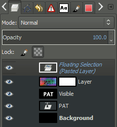
This will now insert a Floating Selection (Pasted Layer) into your image:
To get this Floating Selection into the mask, we need to Anchor it:
This will Anchor the selection down onto the mask. Our image and layers should now look something like this:
We may now want to add a different colored background to help us fine-tune the results we have so far.
Add a new layer to the image as we did when
creating the plasma layer, and place it below the plasma layer.
(You can click and drag layers to change their order in the palette).
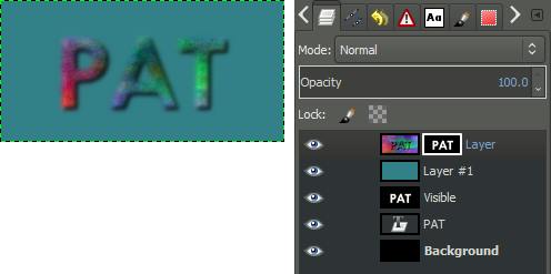
Pick an interesting background color and fill the new layer with this color. The layers should now look like this:
It doesn’t look bad, but we can perhaps tighten up the results by adjusting the mask a bit to clarify the edges of the text.
Adjusting the Levels
I want to clean up the edges of the text with what we have so far.
Right now, the mask being used on the plasma layer is a copy of the gaussian blurred text.
To make it sharper, we are going to adjust the levels on the mask for that layer.
To do this, we first make sure the layer mask is active by clicking on it.
Then we can open the Adjust Color Levels dialog through the menu:
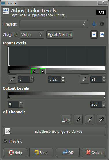
With the Adjust Color Levels dialog, we now want to sharpen up the edges of the mask a little bit:
What we want to do is adjust the Gamma and White point sliders. I started by dragging the White point slider down to increase the prominence of the plasma layer, then pushed the Gamma up to emphasize it more. (If you’re following along, you can also just copy my values from above).
The trick is to increase the definition of the edges of the text,
without going too far and causing it to look very jagged (aliased).
Play with the settings to see how they affect your results. Here is what
my plasma layer looks like after applying the above levels to the mask:
Creating a Drop Shadow
Now we may want to get a little fancier and add an effect of a drop shadow
behind the logo to make it seem as if it’s floating above the
background. We’ve already created what we need to generate this effect,
we just need to move a couple of things around to do so.
Make a copy of your “Visible” layer that had your original blurred text
on it. Select the layer first to activate it, then you can do:
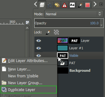
Or Right-Click on the “Visible” layer, and choose “Duplicate Layer”:
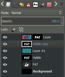
This will create a new layer called “Visible copy”. Move this layer
above your background color layer to just beneath your plasma layer as
shown (you can Left-Click and drag the layer in the palette):
 Click and drag the “Visible copy” layer to beneath the plasma layer
This layer will become our shadow, but we need to modify a couple of
things first. We’ll first invert the colors of the layer to make the
text black using:
Then we need to change the layer so that all of the white areas will be transparent. This can be found in the menu:
The layer should now have black text over a transparent background.
We’ll now just want to shift this layer a bit to simulate a height by
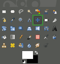
offseting it down and to the right a bit. To do this we can use the Move Tool:
 Activate the Move Tool.
If we hold down Shift and click on the canvas, we restrict the Move Tool
to modifying only the active layer (our shadow layer). Drag the layer
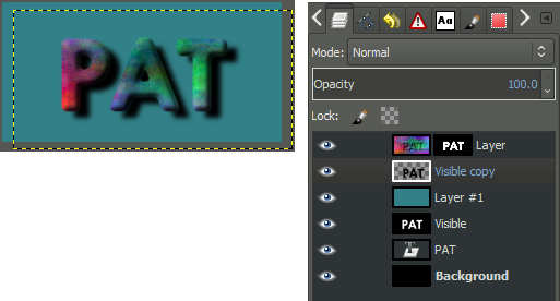
to the right and down a bit to simulate the shadow. I ended up with
this:
 Shadow layer shifted to the right and down a bit.
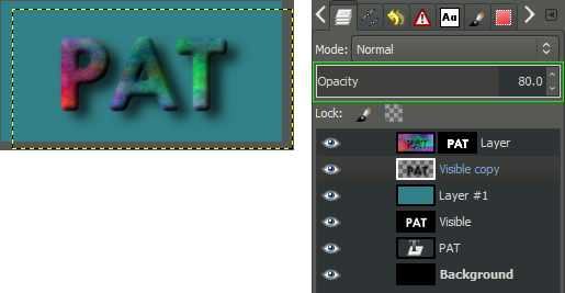
At this point we can make it a bit more fancy by adding a Gaussian Blur to the shadow to spread it out a little more. We can also modify the layer Opacity, adjusting it to let the background show through a bit as well.
Here is the final state of my image, where I applied a Gaussian Blur with a 10px radius, and adjusted the shadow layer Opacity down to 80:
The End
Here is my final floating logo image when everything is done:
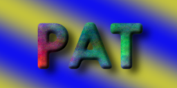
The neat thing about our process is that we can now use any background
we want behind the image, and the effects and shadow will still be
there:
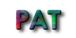
Or we could save it as a PNG file with no background at all, thus allowing whatever background there is to show through:
So that’s it! Go on and have fun making floating logos.
Errata




 Once the tool is